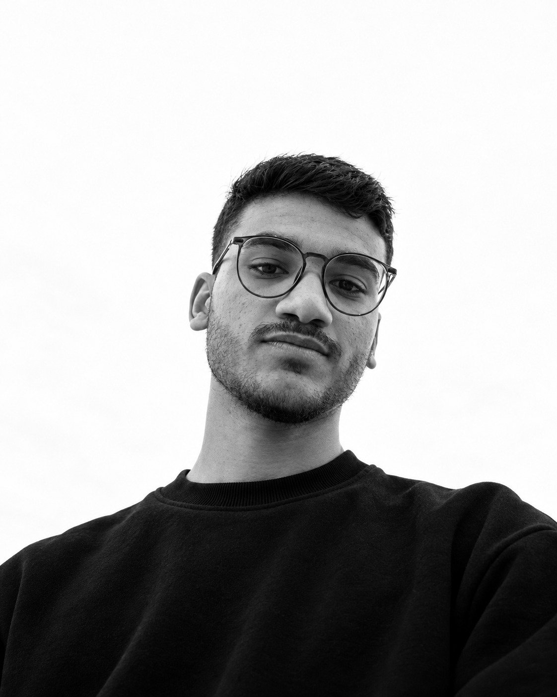
Eyad
Fares

Motion Branding Designer
I give brand identities
a way to move.
Scroll

Work

Motion Branding

Streak

Event management · Motion branding

Streak runs events end to end: stage design, setup and equipment, media coverage, promotional gifts and more.

The motion idea

The symbol comes from a falcon in flight. Speed lines stack into the mark and the services pass by like a fast list. Every move is sharp and direct.

Why it fits the brand

Event management is about timing: everything has to land in the right place at the right second. The falcon gives Streak that idea in one image, speed with control. So every move in the system is fast but never messy. Elements arrive at full speed and stop exactly on their mark.

Pace
Fast
Feel
Sharp and precise
Signature move
Speed lines that stack into the mark

Coastra

Coastal lifestyle · Motion branding

Coastra is a coastal lifestyle brand. Its line is Boundless Horizon.

The motion idea

The film opens on the sea and the horizon, then the logo is drawn from that same curve. Stamps, postcards and editorial pages drift in like souvenirs from a trip. Calm, open and full of light.

Why it fits the brand

Coastra sells a feeling more than a product: the sea, the horizon, a summer trip. The motion carries that feeling, so the brand reads as calm and open on every screen. Nothing snaps or rushes. Elements drift and settle like water.

Pace
Slow
Feel
Calm, open, full of light
Signature move
The horizon curve that draws the logo

Qomel

Pharmaceuticals · Saudi Arabia · Motion branding

Qomel supplies medicine in Saudi Arabia. The identity had to feel precise and dependable, the way a pharmaceutical partner should.

The motion idea

The logo is drawn from its own construction grid: guide lines, a soft capsule, then the Q locks into place. Every move is measured, with no bounce and no noise, so the brand reads as clinical and calm.

Why it fits the brand

In pharmaceuticals, trust comes from precision. Showing the logo being built from its grid tells the viewer this brand is engineered, not decorated. The same measured motion carries into the colors and the applications, so every touchpoint feels clinical and reliable.

Pace
Measured
Feel
Clean and clinical
Signature move
The capsule that becomes the Q

Substance

Specialty coffee · Jeddah · Motion branding

Substance is a coffee brand from Jeddah built around one idea: revealing the essence.

The motion idea

The word Espresso splits open and the life of the bean plays inside it, from cherry to cup. The pace is slow and warm, close to the ritual of making coffee.

Why it fits the brand

Substance is about the essence of coffee, so the motion reveals instead of announcing. Opening the word to show the life of the bean turns the brand line, revealing the essence, into movement. The warm, unhurried pace mirrors the ritual of a slow brew.

Pace
Slow and warm
Feel
Tactile, quiet
Signature move
The word that opens to reveal the bean

WEDX

Events · Motion branding

WEDX, World Events Developers, plans and runs events. Leading ideas, powerful execution.

The motion idea

Pixel blocks and hard cuts echo LED screens and stage lights. The pace is fast and loud on purpose, built for the energy of a live event.

Why it fits the brand

Events live on energy, light and screens. The pixel blocks come from the language of LED walls and stage lighting, so the motion feels like the world WEDX works in, not a generic template. Fast cuts and bold type give the brand the volume of a live show.

Pace
Fast
Feel
Loud and electric
Signature move
Pixel blocks that build and break the frame

Swarah

Creative production house · Saudi Arabia · Motion branding

Swarah is a creative production house in Saudi Arabia, working since 2011. Its message is about vision, focus and delivery.

The motion idea

The curved frame from the identity works like a camera lens. It opens and closes on footage, so every transition feels like a shot being found. Prism light and confident type moves carry the language of film into the brand.

Why it fits the brand

Swarah makes films, so the brand should move like a camera. The curved frame from the identity opens like a lens on each shot, turning a static shape into the brand's way of looking. It gives every application, from posters to billboards, the same cinematic language.

Pace
Steady, cinematic
Feel
Focused and confident
Signature move
The lens-shaped frame that opens on footage

RH Beauty Box

Skincare · Motion branding

RH Beauty Box is a skincare brand with a simple promise: beauty in simplicity.

The motion idea

The monogram builds one letter at a time, R, H, then B, before it settles into its stacked form. Transitions follow the rhythm of a train passing through a quiet station: slow, clean and elegant, like the serif type.

Why it fits the brand

Skincare is about calm and care. Building the monogram one letter at a time gives the logo a quiet moment of attention, the way a skincare routine does. The slow serif motion keeps the brand simple and premium wherever it appears.

Pace
Slow
Feel
Elegant and calm
Signature move
The monogram assembling letter by letter

Trust

Construction · Motion branding

Trust is a construction company. Its line, from the first cut in the ground to the final handover, is about accuracy.

The motion idea

The logo is built like a technical drawing: dashed outlines, measured strokes, then solid form. The U shape becomes a container that frames photos and messages across the whole system.

Why it fits the brand

For a construction company, the logo should feel built, not drawn. Starting from dashed outlines and measured strokes turns the brand promise, accuracy from the first cut to the handover, into something you can see. The U shape then becomes a working tool across the whole system.

Pace
Measured
Feel
Solid and technical
Signature move
Dashed outlines that become solid form

Sewal

Luxury dates · Motion branding

Sewal offers rare Ajwa dates, presented as a gift to remember.

The motion idea

The letters slide into a grid, then the peacock symbol leads into an illustrated garden of palms, a camel and a hoopoe. Movement is slow and ornamental, like opening a luxury box.

Why it fits the brand

Sewal is a gift, so the motion is about the moment of opening. The illustrated garden, the peacock and the slow ornamental movement turn a box of dates into a story worth remembering. The same rhythm carries into the packaging, so the brand feels like heritage, not just a product.

Pace
Slow, ornamental
Feel
Luxurious and warm
Signature move
The peacock leading into the illustrated garden

Touch

Events and gifting · Motion branding

Touch designs for occasions, built on one belief: the beauty of an event lives in its smallest details.

The motion idea

Hand-drawn banana leaves, lavender and floral wreaths grow in around the logo and frame every message. The pace is soft and unhurried, like untying a ribbon, so the motion carries the same refined taste as the packaging.

Why it fits the brand

Touch is about details, so the motion is too. Leaves and flowers grow in gently around the logo, the way a well prepared event comes together piece by piece. The soft pace matches the refined taste the brand promises.

Pace
Soft
Feel
Delicate and refined
Signature move
Illustrations growing in around the logo

Selected brands

StreakCoastraQomelSubstanceWEDXSwarahRH Beauty BoxTrustSewalTouch

Brands

You have an identity. I give it a way to move, with a motion system your team can use on every screen.

Branding studios

You design the identity. I build the motion layer, under your name or alongside it.

Designers

Bring me in at the motion stage. You keep the client. I handle the movement.

How I work

Four steps,
from the brief to the system.

  1. 01UnderstandI study the brand and where it is heading, before anything moves.
  2. 02MoodboardA motion moodboard that fits the brand's direction: its pace, rhythm and feeling.
  3. 03StoryboardI storyboard the direction of the film, and we approve it together.
  4. 04ProductionI animate the film and turn its movement into a system the brand can keep using, built on the same steps.
Eyad Fares

Eyad FaresEgypt

About

Eyad Fares

Motion Branding Designer

I'm a motion designer based in Egypt. My work starts from one question: how should this brand move?

Not a logo animation for one launch, but a set of motion rules a team can use on every screen. I've built motion for brands in Saudi Arabia, Kuwait and Egypt, working directly with companies and inside branding studios.

Get in touch

Your brand has a look.
Let's give it a move.

+20 109 248 4033